Windows 11 22H2 Hands on with new features coming to Start menu
Windows 11 22H2 isn’t a big release, but it comes with plenty of minor improvements, especially for features like Settings and Start Menu. While the Settings app is getting Microsoft accounts integration, the Start menu is getting features which were removed in the original release.
In Windows 11, one of the biggest design overhauls is the Start menu. By default, the Start menu is now placed in the center of the taskbar. The operating system has been redesigned to put everything at the center of your screen, unlike the old days of Windows, when it was possible to move the taskbar to top or left/right and everything was aligned left by default.
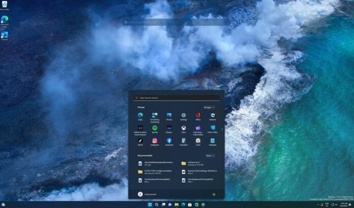
Windows 11’s Start menu comes with simple icons. On the other hand, Windows 10 uses dynamic live tiles and it also allows users to group tiles to further customize the Start menu. The new Start doesn’t come with any option to customize the layout as these features have been removed with Windows 11.
Start menu is getting folders support
If you are coming from Windows 10 or even Windows 8, you’ll notice a big change to the Start menu.
When you open the Start menu on Windows 11, you will notice icons instead of the live tiles. Unlike live tiles, which are used to display live and animated updates like the News and Weather apps, these icons are static and they can display what they are.
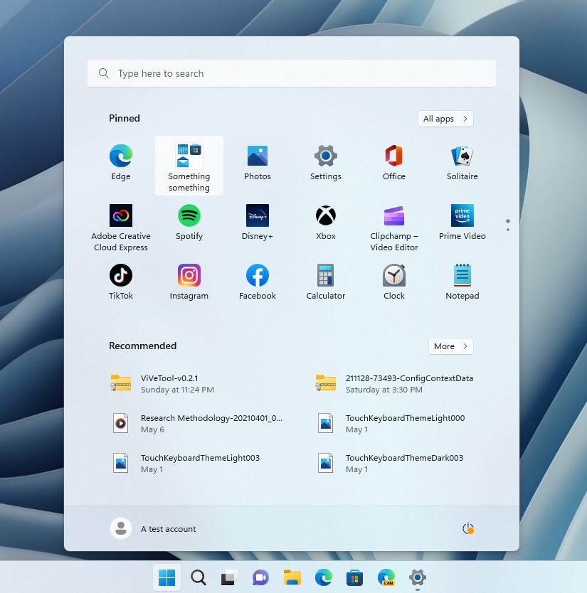
With Windows 11 22H2, Microsoft is adding back some much-needed features to the Start. The first new addition is support for app folders and they much do pretty much what you’d expect – group apps to space save and organize Start.
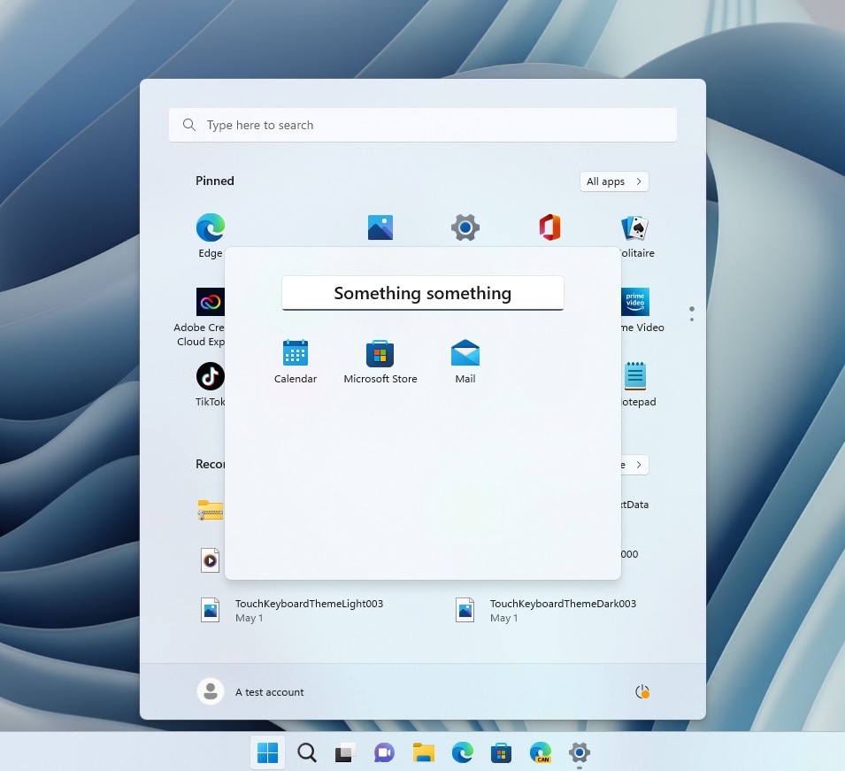
You’ll be able to create folders within the Start by dragging and dropping one app icon onto another. A folder will be created and name these folders too. For example, you can put apps like Amazon Prime and Netflix in a folder called “Entertainment”.
New layouts for Start
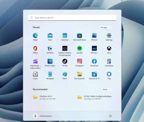
By default, the Start menu shows three rows of icons and recommended activities.
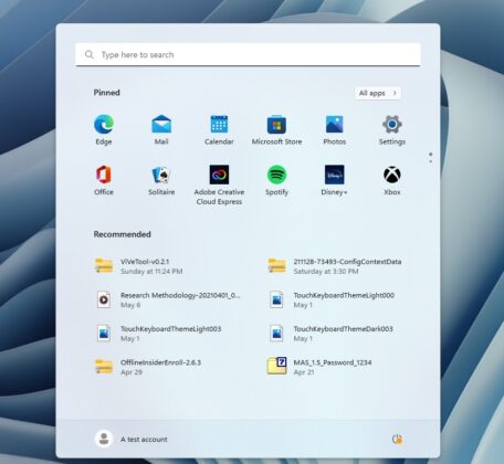
Windows 11 22H2 comes with two new layouts for the Start.
In version 22H2, you can choose between the “More pins” or “More recommendations” option to show an extra row of either pins or recommendations.
New gestures for the Start menu
For tablet users, Microsoft is working on two new touch gestures:
- Swipe to invoke and dismiss Start: You can now do a four-finger swipe from the middle of the taskbar to open the Start menu. You can swipe back down to close it.
- You can now swipe right to left from Pinned to get to All apps in the Start menu. You can also swipe left to right to get back to Pinned.
It goes without saying live tiles on the Start menu offer a lot of ways to customize the experience. Unfortunately, live tiles are never returning to the OS as the company has given up on tiles.
Windows 11 22H2 is expected to launch in October 2022 and Microsoft has confirmed Build 22621 as the RTM (feature-locked version) of the update.

