Firefox View Doesn’t Feel Like a Feature, Mozilla. It Feels Like a Nag
I run beta builds of Firefox on my desktop and noticed something unexpected had recently prepended itself to my browser’s tab bar.
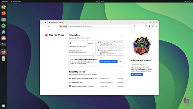
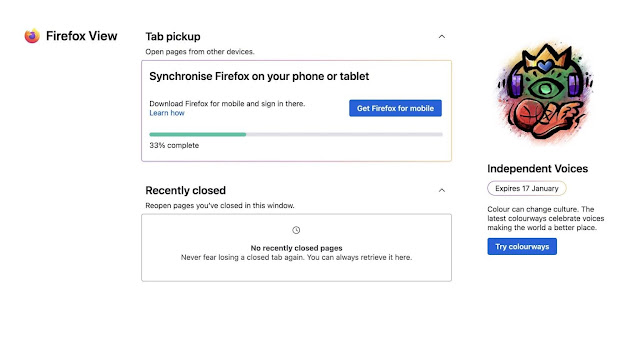
The unexpected addition (that masquerade as a pinned tab) is for new feature (in testing) called Firefox View. This is a dashboard-style overview showing your 3 most recently closed tabs, plus sections to “pickup” tabs you’re gawking at on your other devices, and promotion for more limited-edition “colorways” (no idea, lol).
But… I need to digress 
As a Linux user I take for granted how omnipresent Firefox is. In FOSS-world, this browser is still a big deal; I can pretty much count on a lone hand the number of major Linux distros that don’t ship it as their default browser. Also: it’s very widely used — Firefox is the browser zeitgeist, innit.
But out in the wider world? There, Firefox fares a lot worse. Its desktop marketshare continues to plummet year on year, and is now pegged at sub 5% in America — for the one-time rival to Internet Explore. On mobile Firefox isn’t even an afterthought: it is no-where in terms of marketshare or (more importantly for this rant) mindshare.
Which is presumably the motivation for putting Firefox View so clearly in-view. It’s a jab in the eye to remind me that Firefox for Android and iOS exist and, hey, I should be using them.

Now, the folks at Mozilla are an awesome bunch. I’m sure they’ve done research that tells them that (some of) their users are clamouring for a dashboard on their desktop to let them pickup tabs from other devices more easily on desktop.
And on that score, Firefox View should be pretty helpful.
But it doesn’t feel helpful. It feels unasked for, and worse: it feels kinda naggy. It’s a feature looking for a problem, almost.
First up, making Firefox View the first thing in the tab strip? That’s a bit entitled. It’s telling me I should care about tabs I’ve closed more than ones I’m actively browsing — and I don’t.
Secondly, the faux-tab appears regardless of whether I sign into my Firefox account (and thus am actively using the browser on other devices to pickup tabs from). Since I can “pick up” tabs from other devices using the Firefox Account toolbar menu (if I do sign in), and that keeps out of my eye-line ’til I need it, why should I care about this?
And then there’s the functionality itself. Showing me tabs from other devices is passively useful (but Firefox already could do it) but only showing me the last 3 tabs I closed? On a page as expansive as this? It feels excessive. Besides: browser history is a thing. If I need to re-open tabs I chose to close, I can do it already.

Most bafflingly of all: Mozilla dedicates a sizeable section of this new View tab to promoting it’s limited edition Firefox colour-ways that a) don’t have anything to do with ‘other devices’, and b) I really couldn’t give two hoots about.
Firefox View does come with some basic onboarding in the beta builds but this doesn’t explain why Firefox View is its own separate thing. I mean, couldn’t this just be a list on the New Tab page (if it has to be a thing at all; History and the existing Firefox Sync menu does all this already)?
But hey: Mozilla would need to push those Recommend Pocket stories (I also don’t care for) out of the way to do it.
The good news is that it is easy to remove Firefox View from the tab strip. You right-click on its icon and choose “remove from toolbar” (yes, despite looking like a tab, it’s not a tab) If you later regret removing it you can add it back and you can choose where it goes.
Since I do not use Firefox on my phone or iPad, despite desktop Firefox’s optimistic lures to get me to send myself a reminder to download it, visually accosting me with a(another) new tab page experience isn’t going to change that either, sorry.


